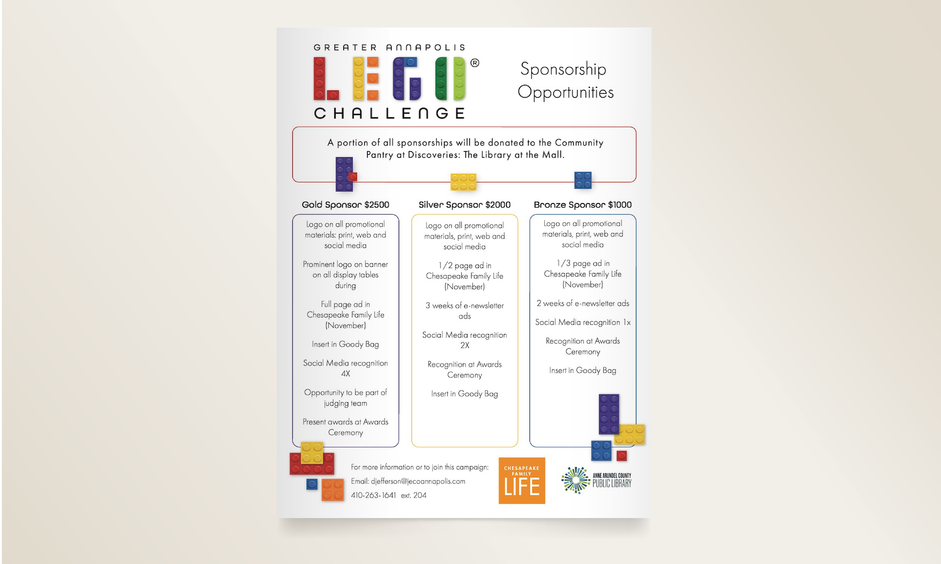
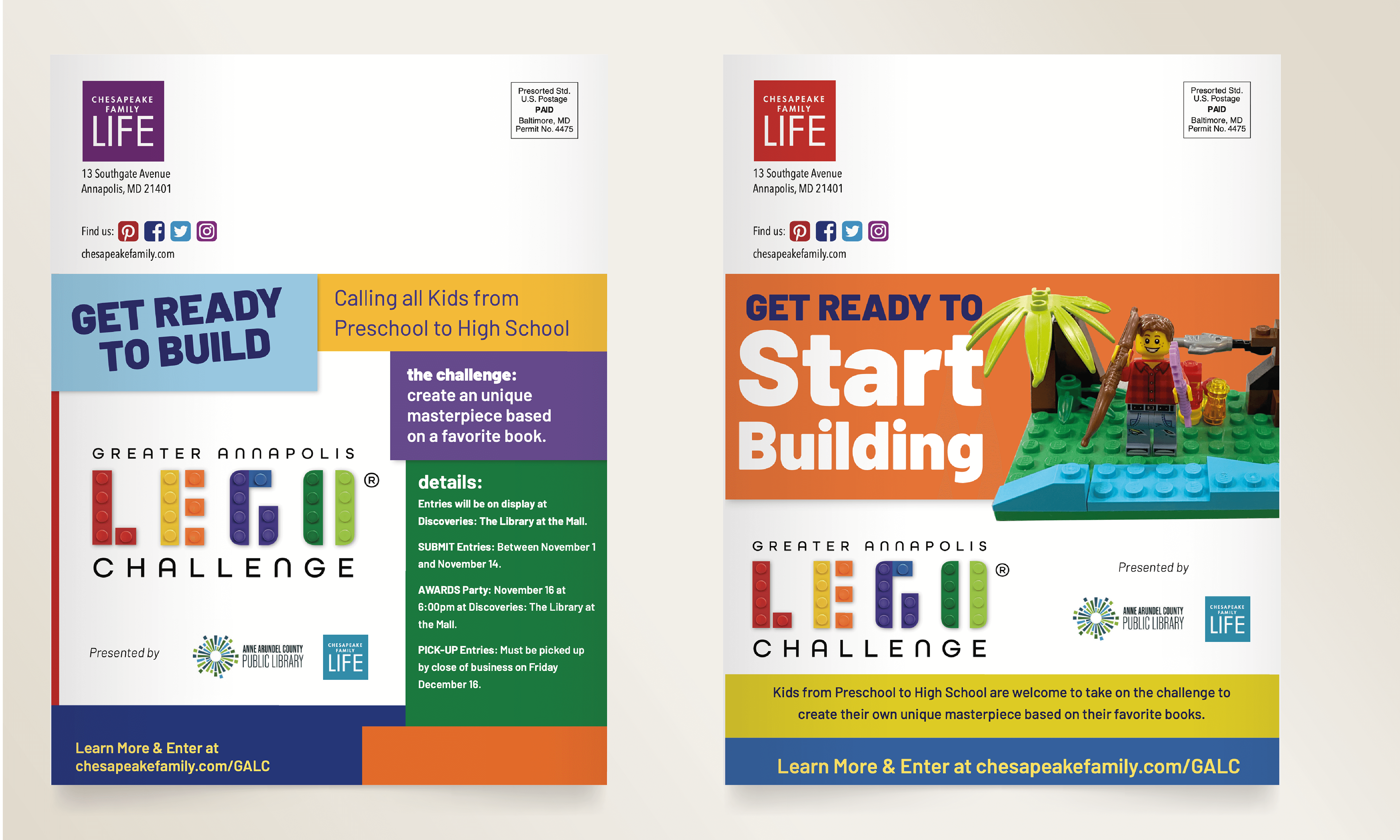
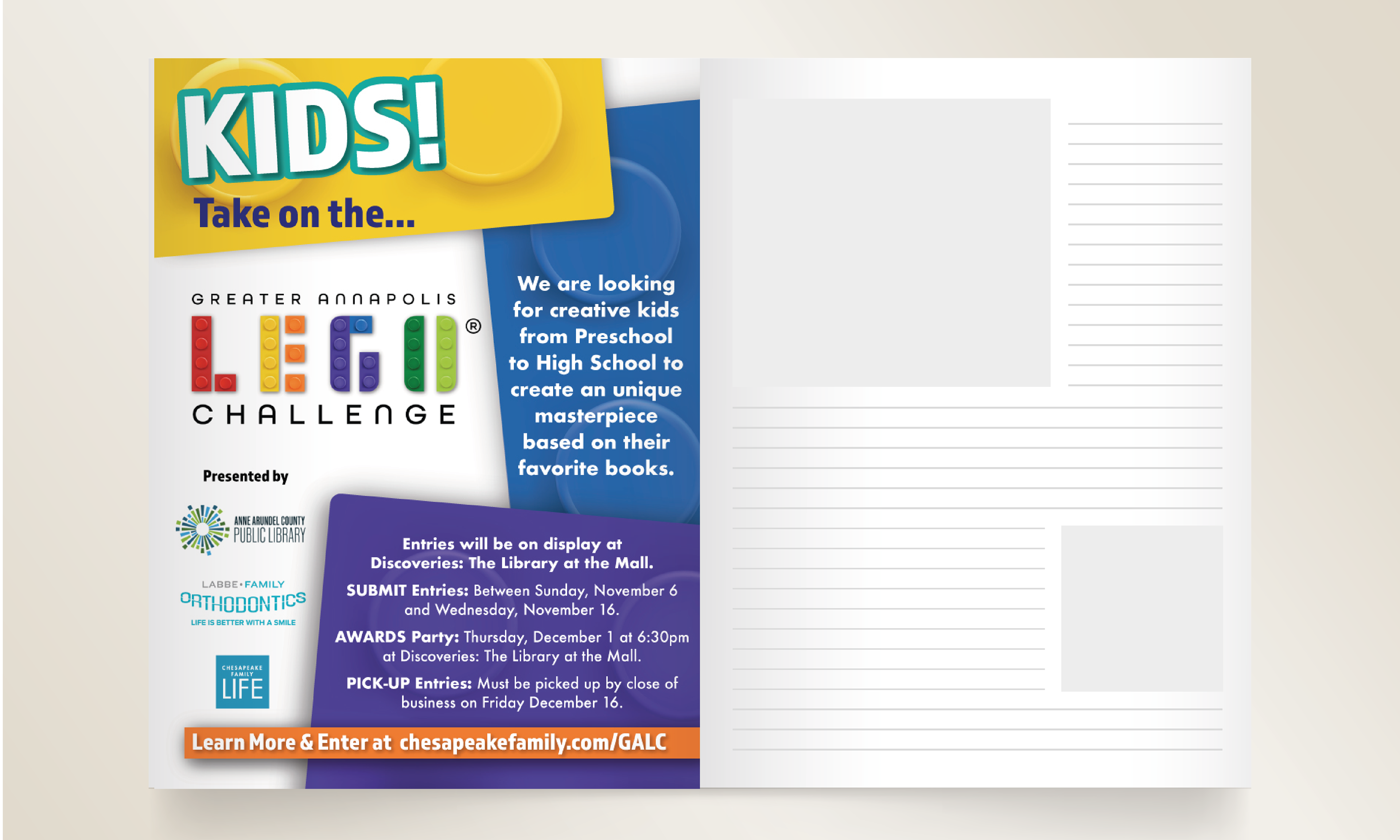
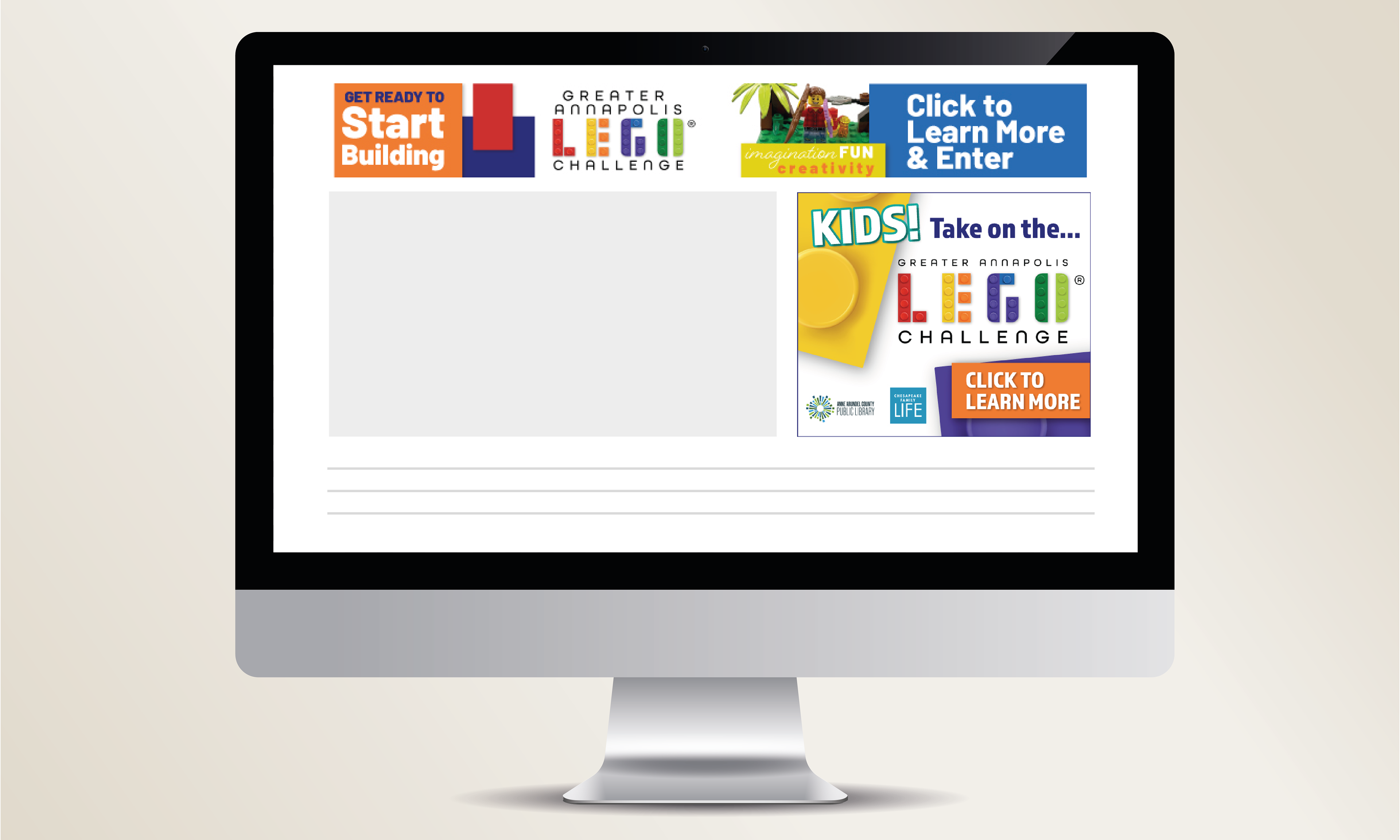
After a name change and new management, this annual local contest required a complete visual refresh, including a new logo and all promotional materials. The goal was to create a look that felt playful yet modern, with a design sensibility that would resonate with architects. The logo was inspired by the contest’s use of a popular building block, which informed the overall shape and structure. Rounded edges were intentionally incorporated to complement the modern typography and create a cohesive, contemporary mark.
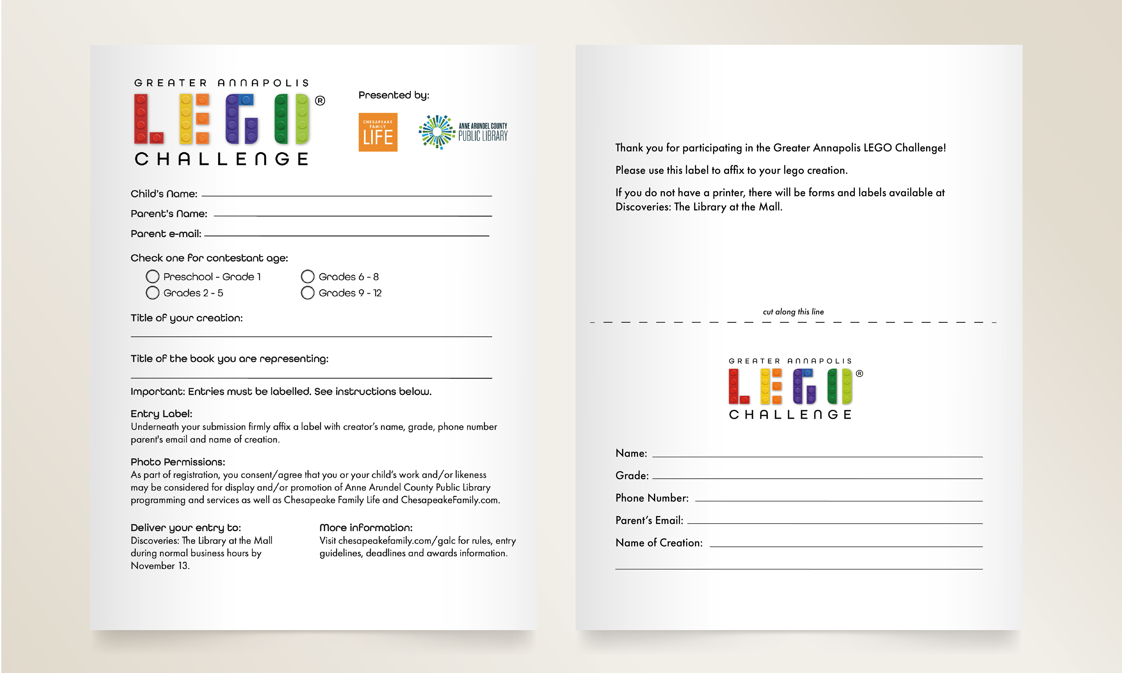
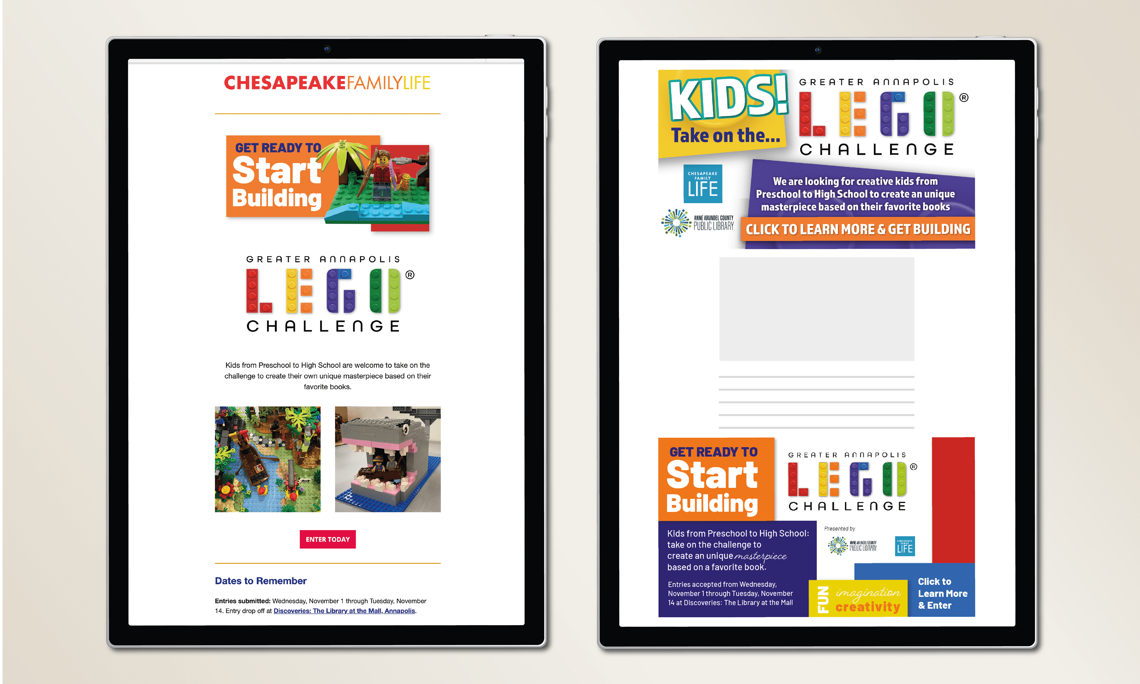
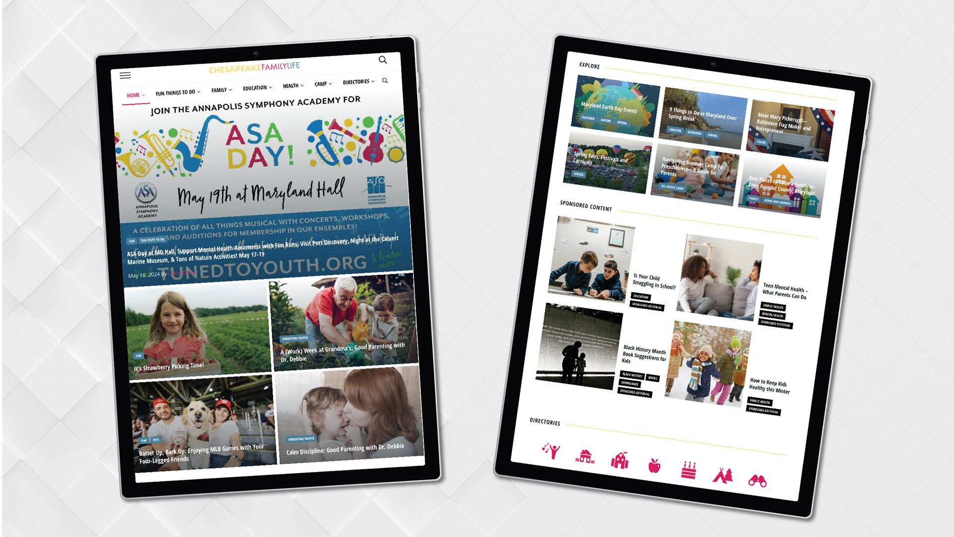
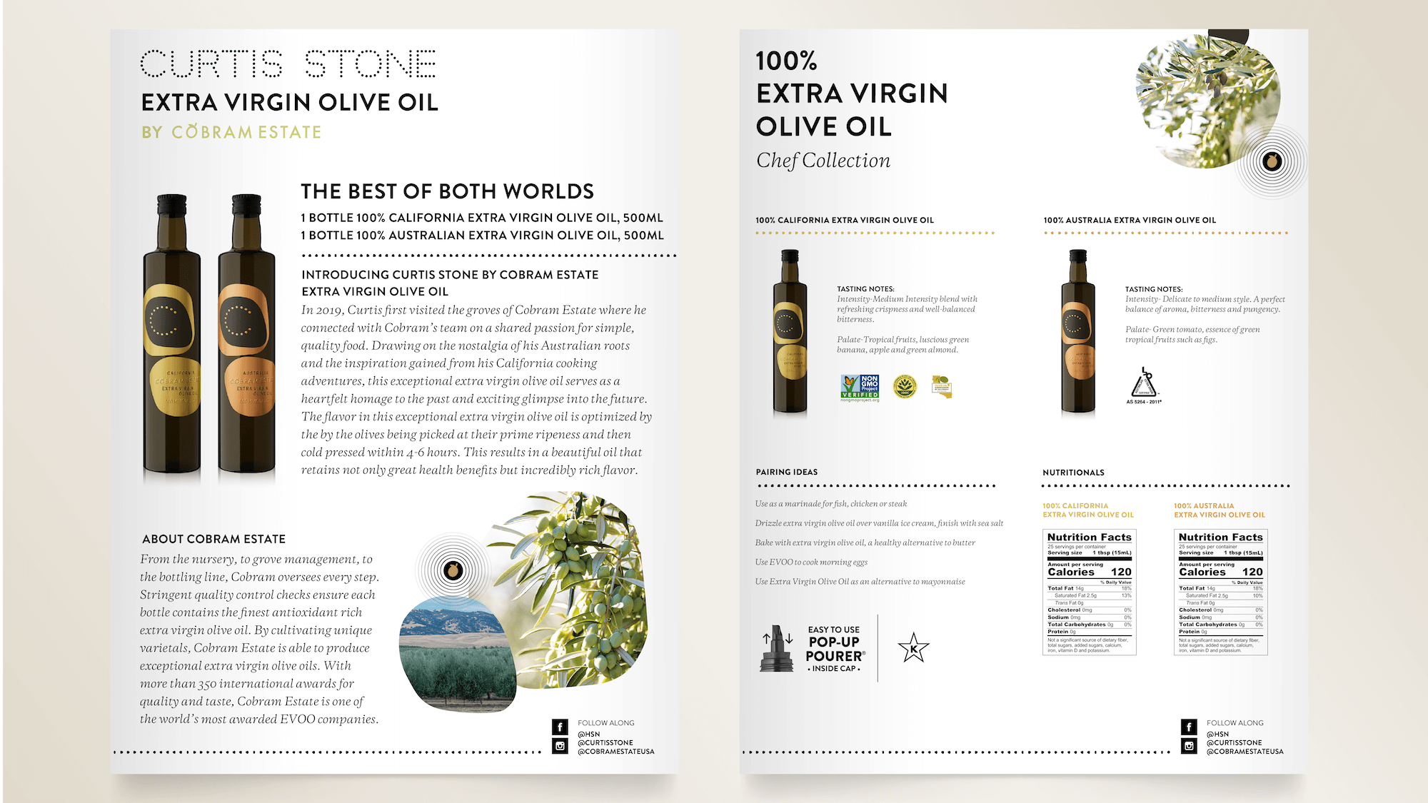
This playful yet refined style carried through the full campaign, using bold color balanced with clean white space. The final deliverables spanned a wide range of touch points, including video, B2B marketing materials, and public-facing assets such as print ads, web ads, email campaigns, and entry forms, resulting in a cohesive and recognizable campaign across all platforms.
